Viewing and Analyzing Broadcast Reports in Zaple
Zaple offers an intuitive platform that enables you to easily track and analyze the performance of your message broadcasts. This guide will walk you through the process of accessing broadcast reports and understanding the valuable insights they provide. By the end of this guide, you’ll have the knowledge to make data-driven decisions and enhance the effectiveness of your messaging campaigns.

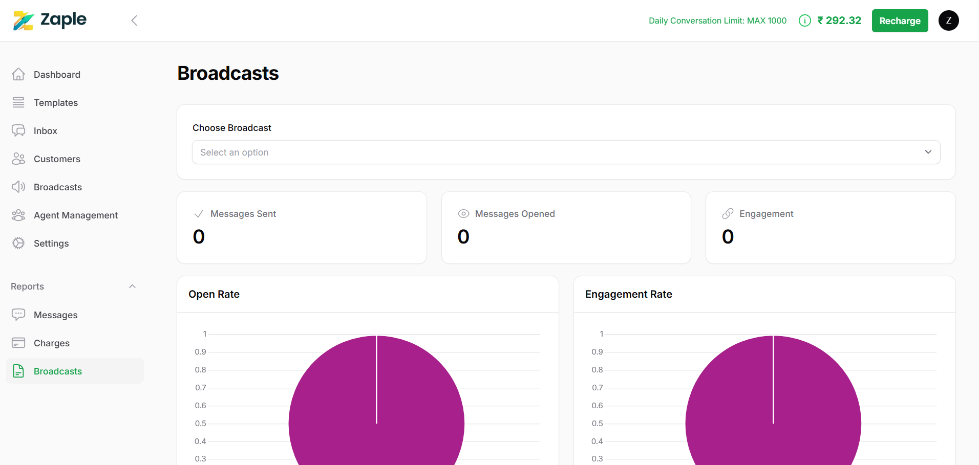
Navigate to the Broadcast Reports Section
1. Log into your Zaple account: Start by signing into your Zaple account using your credentials.
2. Access the left-hand menu: Once logged in, look for the menu located on the left side of the screen.
3. Find the “Reports” section: Within the menu, locate the “Reports” option.
4. Click on “Broadcasts”:Under the “Reports” section, you should see multiple options related to different types of reports. Click on the “Broadcasts” option to open the broadcast analytics page. This will display a detailed overview of all your broadcast messages, including delivery rates, recipient engagement, click-through rates, and other valuable metrics.

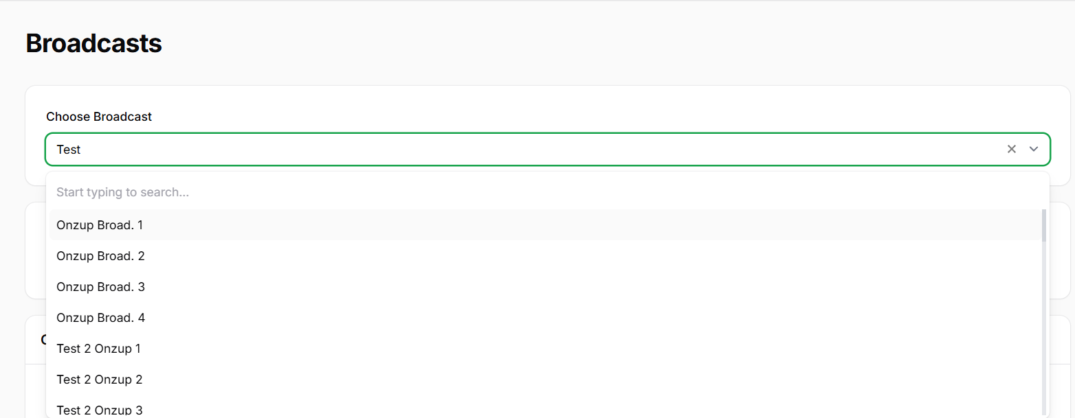
Select a Specific Broadcast
Review the Key Metrics Displayed

Visualize Performance Using Charts

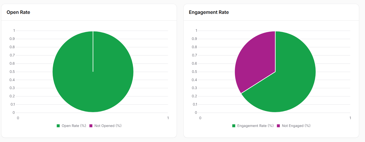
To make it easier to interpret your broadcast performance, Zaple provides visual charts that offer a clear, at-a-glance summary of key metrics. These charts are designed to help you quickly grasp important insights about how well your broadcast resonated with your audience.
Open Rate Pie Chart:
– The Open Rate Pie Chart visually displays the proportion of messages that were opened compared to those that were not. This chart provides an immediate, easy-to-understand overview of how many recipients actually engaged with the message by opening it.
– A higher open rate typically indicates that the subject line, preview text, or timing of the message was compelling enough to capture recipients’ attention. It suggests that your message was relevant and enticing to your target audience.
Engagement Rate Pie Chart:
– The Engagement Rate Pie Chart showcases the percentage of recipients who took action after receiving the message. Engagement actions could include clicking on links, replying to the message, or completing other desired actions you have defined in your campaign.
– A higher engagement rate indicates that your content was engaging, your message was clear, and your calls to action were effective in prompting recipients to interact. This suggests that your audience found the message valuable and worth responding to.
Both charts provide an easy way to understand the effectiveness of your broadcast. By comparing these visual insights, you can identify patterns in how your message was received, allowing you to optimize your future campaigns for better reach and engagement.
This guide will help you understand your Broadcast Performance, enabling you to optimize your messaging strategies for better results. With Zaple’s user-friendly interface and valuable metrics, tracking and improving your campaigns is easy and efficient.
